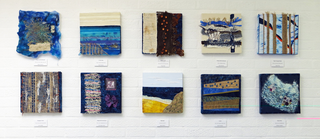
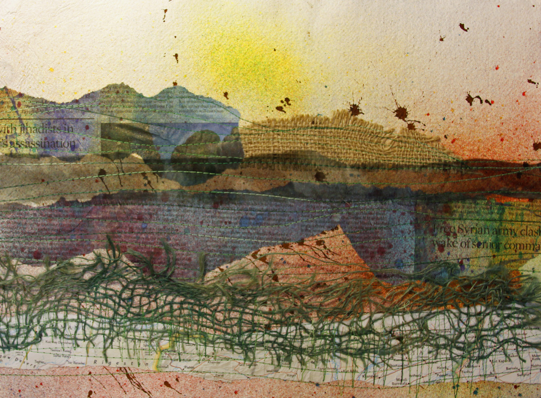
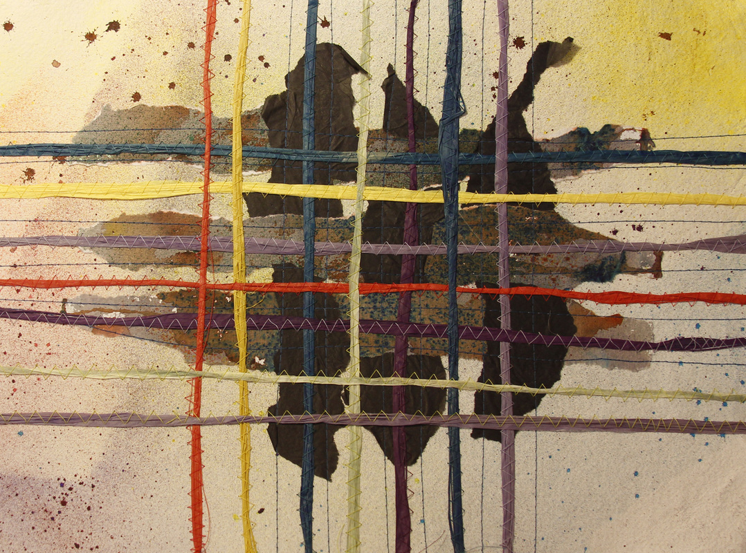
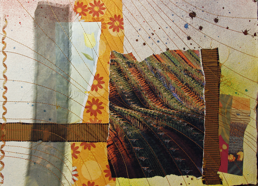
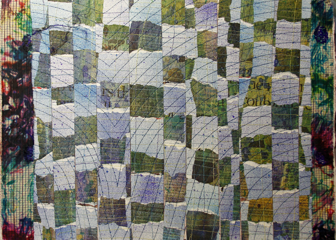
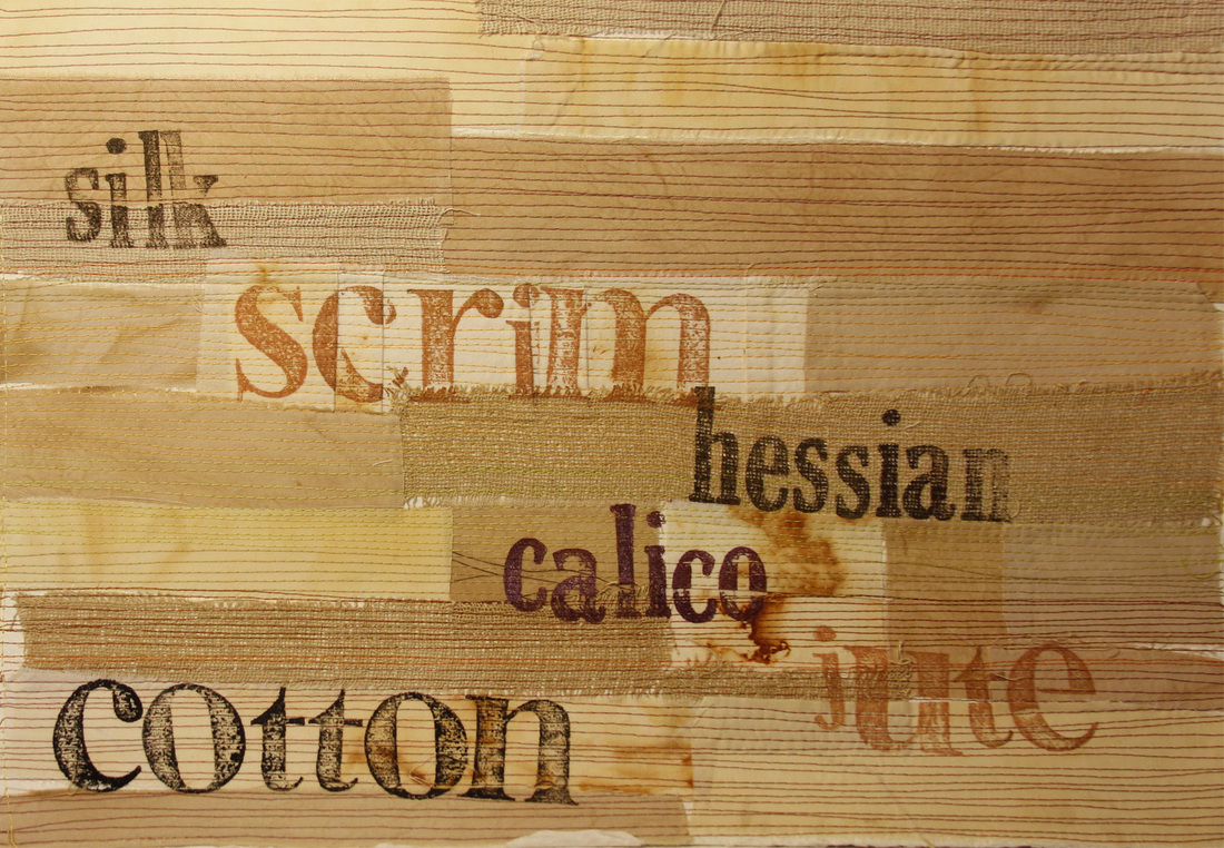
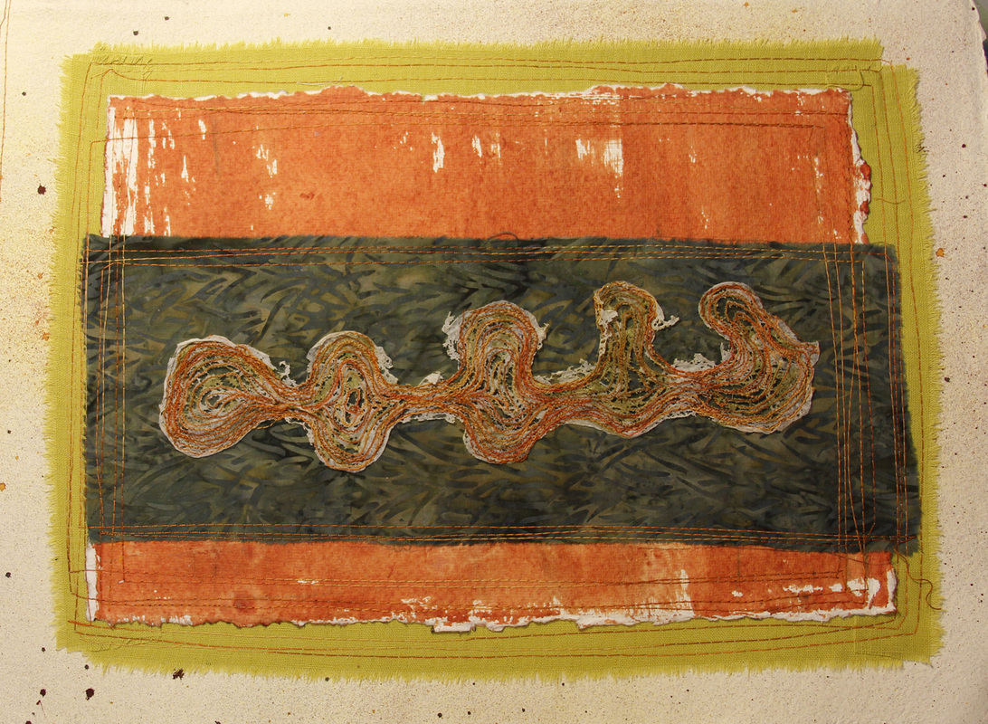
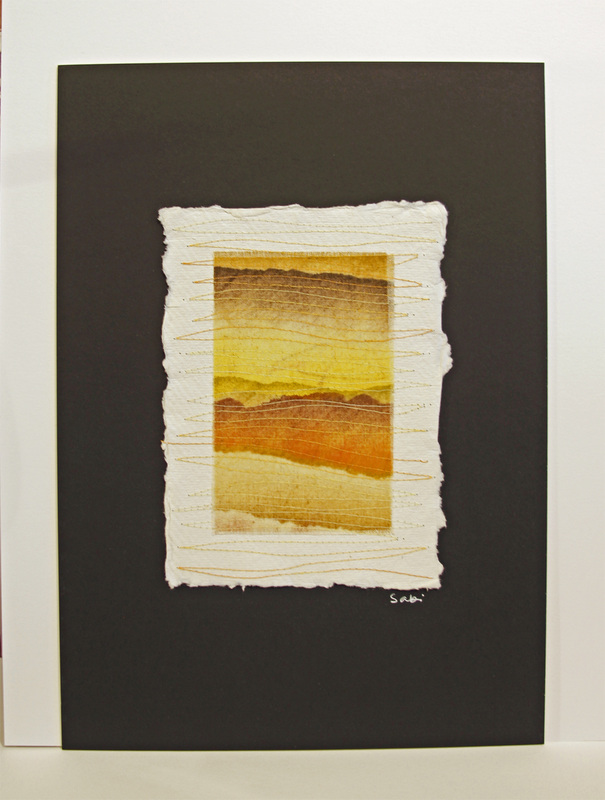
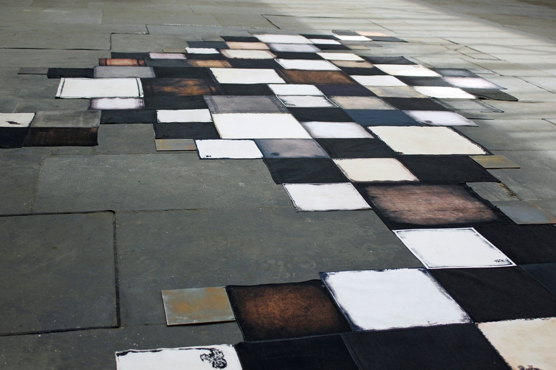
In my first post about this show, I mentioned a section of work which was going to be mounted on 12" square canvases, with each piece incorporating two specific fabrics - a jute scrim and a cobalt blue batik.
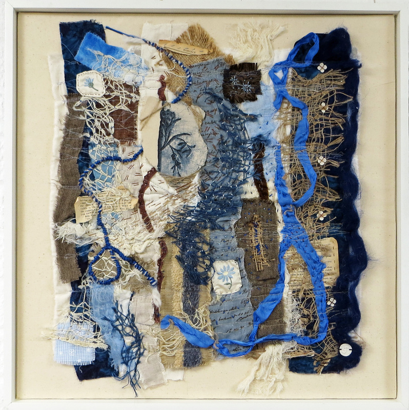
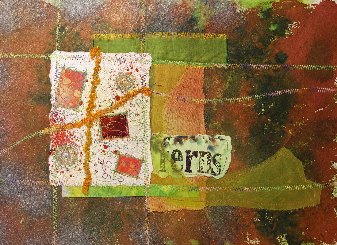
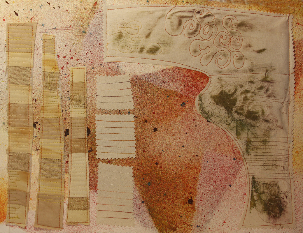
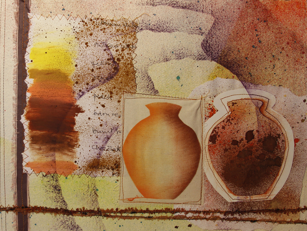
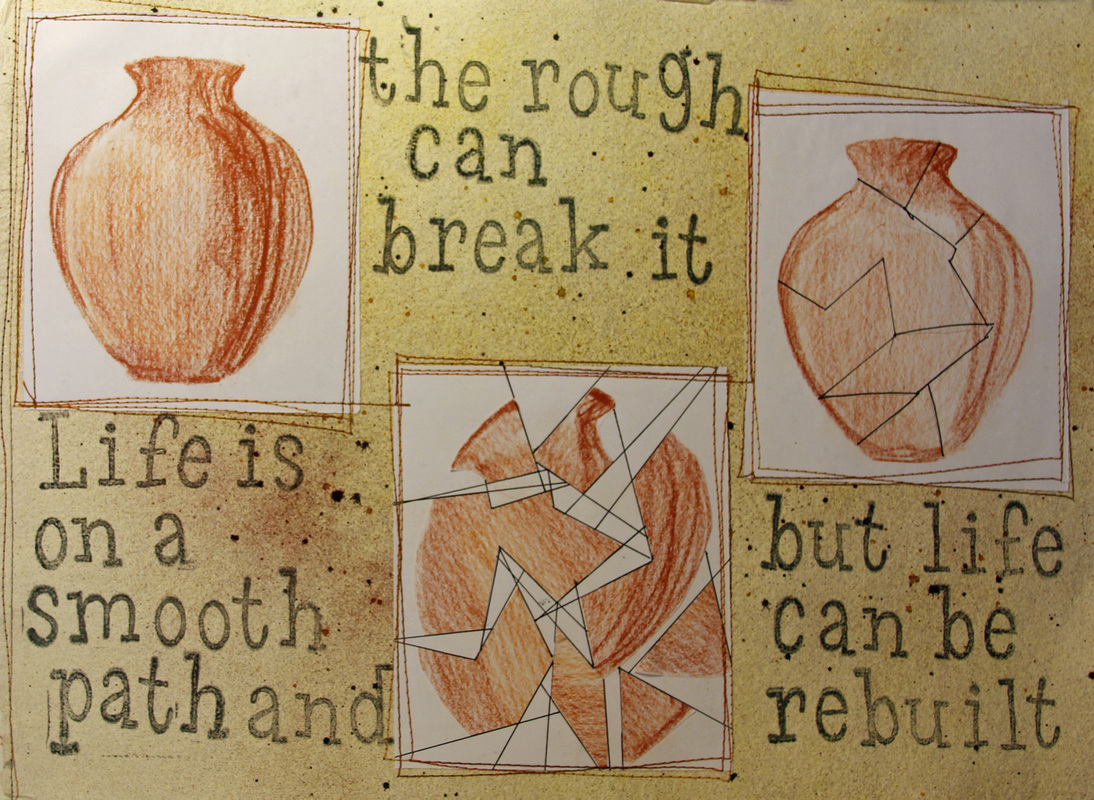
The photograph below shows the finished pieces - I believe they work well together, in spite of the varied uses of the fabrics. Indeed, in some pieces the viewer really has to look hard to spot them!
The photograph below shows the finished pieces - I believe they work well together, in spite of the varied uses of the fabrics. Indeed, in some pieces the viewer really has to look hard to spot them!